Render Options
renderMarkdown accepts an optional second argument of type RenderMarkdownOptions:
const pages = await renderMarkdown(markdown, {
  format: 'png',                          // 'png' | 'svg'
  singlePage: false,                      // render into one image instead of paginating
  theme: 'dark',                          // built-in theme name or ThemeOverrides object
  scale: 2,                               // PNG pixel density multiplier (default: 2)
  codeHighlighting: { theme: 'nord' },    // Shiki theme — auto-detected if omitted
})
format
Type: 'png' | 'svg'
Default: 'png'
Controls the output format for each page.
| Value | Output | page.data type |
|---|---|---|
'png' | Raster image | Buffer |
'svg' | Vector markup | string (UTF-8) |
// PNG (default)
const pngPages = await renderMarkdown(markdown, { format: 'png' })
pngPages[0].data // Buffer

// SVG
const svgPages = await renderMarkdown(markdown, { format: 'svg' })
svgPages[0].data // string
Rendered output (PNG):
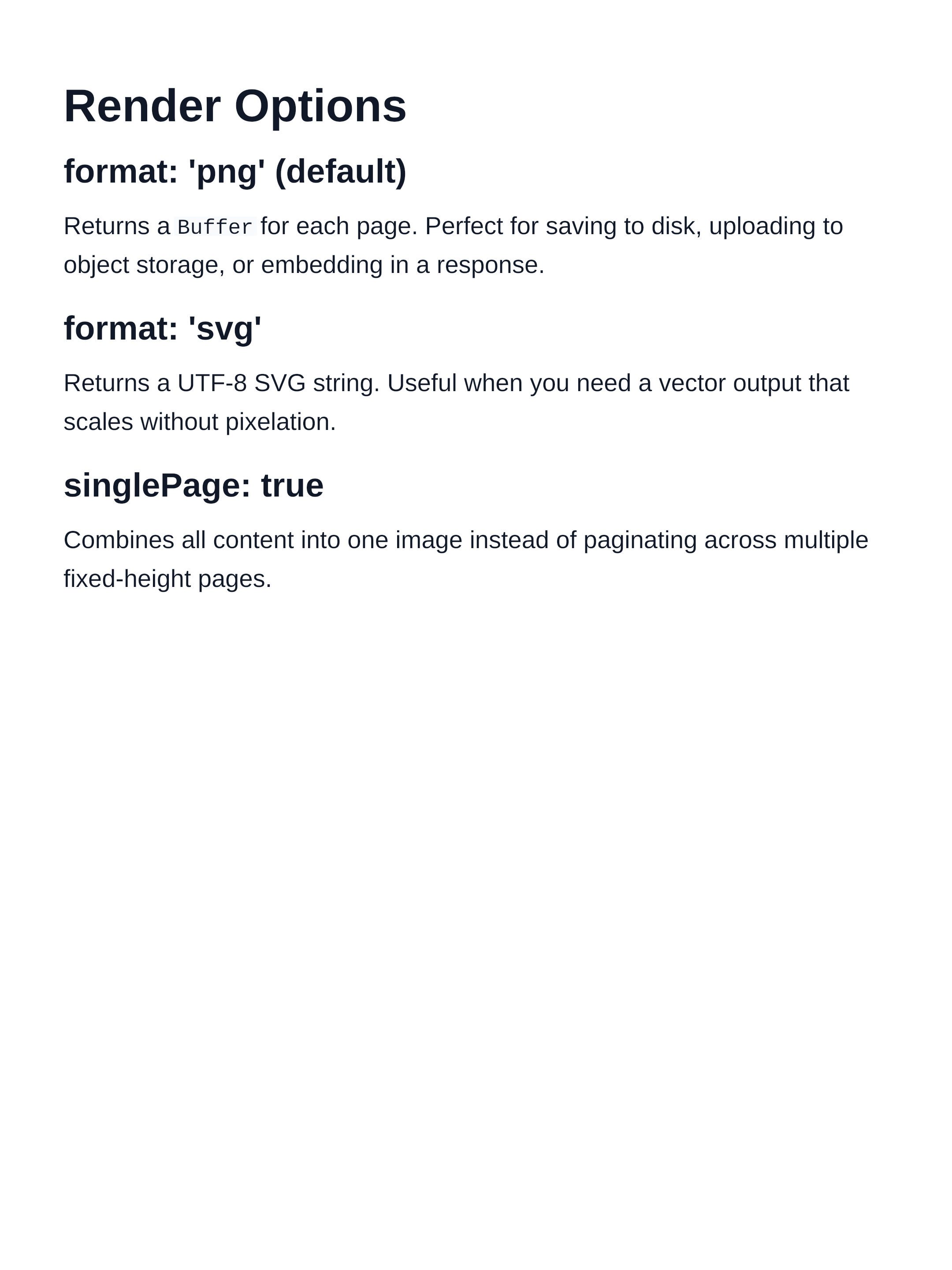
singlePage
Type: boolean
Default: false
When true, all content is placed into a single image whose height adapts to the content, rather than being split across multiple fixed-height pages.
const [page] = await renderMarkdown(markdown, { singlePage: true })- The image height is capped at
MAX_SINGLE_PAGE_HEIGHT(16 384 px). Content beyond that point is clipped. - The width is always the page width from the active theme.
See Single-Page Mode for more details.
theme
Type: BuiltInThemeName | ThemeOverrides
Default: defaultTheme
Controls all visual properties: colors, typography, spacing, page size, and background gradients.
Built-in theme by name:
const pages = await renderMarkdown(markdown, { theme: 'dark' })
const pages = await renderMarkdown(markdown, { theme: 'nord' })
Available names: 'default', 'github', 'solarized', 'sepia', 'rose', 'dark', 'nord', 'dracula', 'ocean', 'forest'.
Partial override (merged onto defaultTheme):
const pages = await renderMarkdown(markdown, {
  theme: {
    colors: { background: '#1e1e2e', text: '#cdd6f4' },
    page: { width: 800 },
  },
})
Full control with mergeTheme:
import { mergeTheme, getBuiltInTheme } from 'marknative'

const myTheme = mergeTheme(getBuiltInTheme('nord'), {
  colors: { link: '#ff6b6b' },
})

const pages = await renderMarkdown(markdown, { theme: myTheme })
See the Themes guide for the complete reference.
scale
Type: number
Default: 2
Applies to: PNG output only (format: 'png')
Pixel density multiplier for the rasterised PNG output. The logical page dimensions (from theme.page) are multiplied by this factor to produce the physical canvas size.
| Value | Physical resolution | Encode time | Use case |
|---|---|---|---|
1 | 1080 × 1440 px | ~29 ms | Fast preview / drafts |
1.5 | 1620 × 2160 px | ~58 ms | Balanced |
2 | 2160 × 2880 px | ~99 ms | Retina (default) |
3 | 3240 × 4320 px | ~214 ms | Print / high-DPI |
PNG encode time scales with pixel count (proportional to scale²). SVG output is unaffected by this option.
// Fast preview
const pages = await renderMarkdown(md, { scale: 1 })

// Default retina quality
const pages = await renderMarkdown(md)                  // scale: 2 implicit
const pages = await renderMarkdown(md, { scale: 2 })    // same

// Print quality
const pages = await renderMarkdown(md, { scale: 3 })
See Performance for a full breakdown of encode costs at each scale.
codeHighlighting
Type: { theme?: string }
Default: auto-detected from page background
Enables syntax highlighting for fenced code blocks, powered by Shiki.
| Sub-option | Type | Default | Description |
|---|---|---|---|
theme | string | auto | Any Shiki-supported theme name |
Auto-detection: when theme is omitted, marknative selects a Shiki theme based on the WCAG relative luminance of the page background color:
- Light page background →
'github-light' - Dark page background →
'github-dark'
This means dark marknative themes ('dark', 'nord', 'dracula', 'ocean', 'forest') automatically produce legible dark code highlighting — no extra configuration needed.
// Auto-detected (light → github-light)
const pages = await renderMarkdown(md)

// Auto-detected (dark → github-dark)
const pages = await renderMarkdown(md, { theme: 'dark' })

// Override explicitly
const pages = await renderMarkdown(md, {
  theme: 'nord',
  codeHighlighting: { theme: 'one-dark-pro' },
})
Shiki is loaded lazily on first use — there is no overhead when no code blocks are present.
Popular Shiki theme names:
| Light | Dark |
|---|---|
github-light | github-dark |
min-light | one-dark-pro |
catppuccin-latte | nord |
dracula | |
tokyo-night |
For the full list, see the Shiki themes reference.
Fallback behaviour: code blocks without a language tag, or with an unrecognised language, are rendered as plain monochrome text (no highlighting applied).
painter
Type: Painter (internal interface)
Default: skia-canvas painter
Advanced option for supplying a custom paint backend. Useful for testing or alternative rendering targets.
This option is intended for library integrators. Most users should not need it.