API Reference
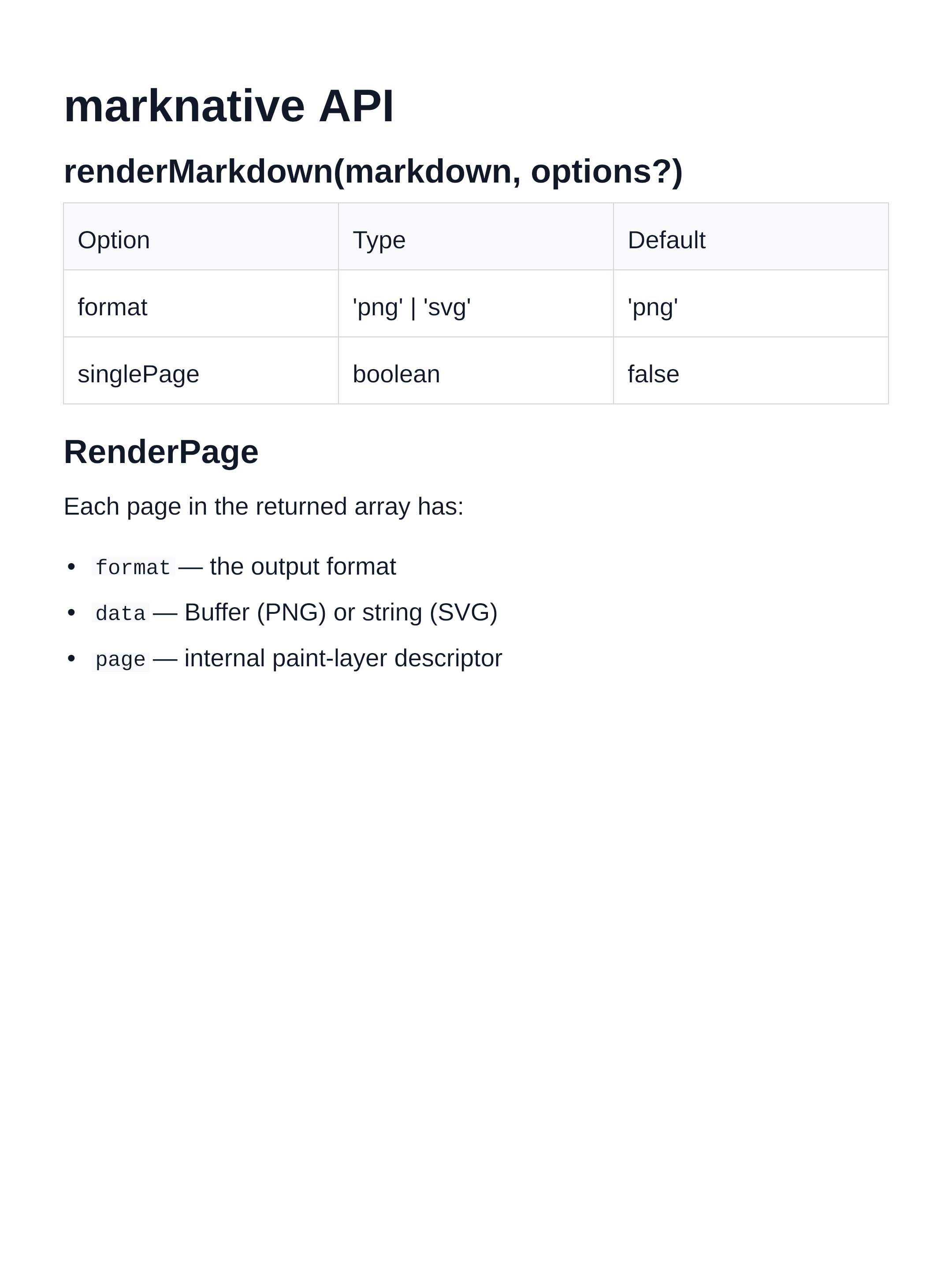
renderMarkdown
function renderMarkdown(
  markdown: string,
  options?: RenderMarkdownOptions
): Promise<RenderPage[]>
Parses markdown and renders it into one or more pages.
Parameters
| Parameter | Type | Description |
|---|---|---|
markdown | string | The Markdown source text to render |
options | RenderMarkdownOptions | Optional render configuration |
Returns
Promise<RenderPage[]> — an array of rendered pages, one entry per page.
Example
import { renderMarkdown } from 'marknative'

const pages = await renderMarkdown('# Hello\n\nWorld.')

for (const page of pages) {
  if (page.format === 'png') {
    // page.data is a Buffer
  }
}
Rendered output:
RenderMarkdownOptions
type RenderMarkdownOptions = {
  format?: 'png' | 'svg'
  singlePage?: boolean
  theme?: BuiltInThemeName | ThemeOverrides
  scale?: number
  painter?: Painter
  codeHighlighting?: {
    theme?: string  // Shiki theme name — auto-detected from page background if omitted
  }
}
Properties
format
Type: 'png' | 'svg'
Default: 'png'
Output format for each rendered page.
'png'— raster PNG image;page.datais aBuffer'svg'— vector SVG;page.datais astring
singlePage
Type: boolean
Default: false
When true, renders all content into a single image instead of paginating across multiple fixed-height pages. The image height adapts to the content and is capped at MAX_SINGLE_PAGE_HEIGHT.
theme
Type: BuiltInThemeName | ThemeOverrides
Default: defaultTheme
Controls all visual properties. Accepts either:
- A
BuiltInThemeNamestring such as'dark'or'nord' - A
ThemeOverridesobject that is merged ontodefaultTheme
// Built-in name
await renderMarkdown(md, { theme: 'dracula' })

// Partial override
await renderMarkdown(md, { theme: { colors: { background: '#000' } } })
scale
Type: number
Default: 2
Applies to: PNG output only
Pixel density multiplier. The logical page width/height from the active theme are multiplied by this value to determine the physical canvas resolution. Higher values produce sharper images at the cost of larger files and longer encode times (PNG compression scales with pixel count).
await renderMarkdown(md, { scale: 1 })   // ~29 ms — preview
await renderMarkdown(md, { scale: 2 })   // ~99 ms — retina (default)
await renderMarkdown(md, { scale: 3 })   // ~214 ms — print
codeHighlighting
Type: { theme?: string }
Default: auto-detected from page background luminance
Controls syntax highlighting for fenced code blocks. Highlighting is powered by Shiki and runs server-side before layout.
theme— any Shiki-supported theme name (e.g.'github-dark','nord','one-dark-pro','dracula'). When omitted, the theme is auto-selected: light page backgrounds use'github-light', dark page backgrounds use'github-dark'.- Code blocks with an unknown or missing language tag fall back to plain monochrome text — no
codeTokenruns are produced.
// Auto-detection: light page → github-light
const pages = await renderMarkdown(md)

// Auto-detection: dark page → github-dark
const pages = await renderMarkdown(md, { theme: 'dark' })

// Explicit override
const pages = await renderMarkdown(md, {
  theme: 'nord',
  codeHighlighting: { theme: 'one-dark-pro' },
})
painter
Type: Painter
Default: internal skia-canvas painter
Advanced: supply a custom paint backend. Intended for library integrators and testing.
RenderPage
type RenderPage =
  | { format: 'png'; data: Buffer; page: PaintPage }
  | { format: 'svg'; data: string; page: PaintPage }
A discriminated union based on format.
Properties
| Property | Type | Description |
|---|---|---|
format | 'png' | 'svg' | The output format of this page |
data | Buffer | string | The rendered image data |
page | PaintPage | Internal paint-layer page descriptor |
Example
const pages = await renderMarkdown(markdown, { format: 'png' })

for (const [i, page] of pages.entries()) {
  if (page.format === 'png') {
    writeFileSync(`page-${i + 1}.png`, page.data)
  }
}
MAX_SINGLE_PAGE_HEIGHT
const MAX_SINGLE_PAGE_HEIGHT: number // 16384The maximum height (in CSS pixels) of a single-page render. Content beyond this height is clipped. Exported for consumers that need to check or display the limit.
import { MAX_SINGLE_PAGE_HEIGHT } from 'marknative'

console.log(MAX_SINGLE_PAGE_HEIGHT) // 16384
parseMarkdown
function parseMarkdown(markdown: string): MarkdownDocumentLow-level: parse Markdown source text into the internal MarkdownDocument AST. Useful for inspection or custom processing pipelines.
defaultTheme
const defaultTheme: ThemeThe built-in default theme. Page size is 1080 × 1440 px (portrait card ratio). Exported for use as a base with mergeTheme.
import { defaultTheme } from 'marknative'

console.log(defaultTheme.page)
// { width: 1080, height: 1440, margin: { top: 80, right: 72, bottom: 80, left: 72 } }
mergeTheme
function mergeTheme(base: Theme, overrides: ThemeOverrides): ThemeMerge a partial theme override onto a base theme. Each nested object (page, typography, blocks, colors) is merged shallowly at its own level — you only need to supply the keys you want to change.
import { mergeTheme, defaultTheme, getBuiltInTheme } from 'marknative'

// Build on defaultTheme
const myTheme = mergeTheme(defaultTheme, {
  page: { width: 800 },
  colors: { background: '#1e1e2e', text: '#cdd6f4' },
})

// Build on a built-in theme
const customNord = mergeTheme(getBuiltInTheme('nord'), {
  colors: { link: '#ff6b6b' },
})
getBuiltInTheme
function getBuiltInTheme(name: BuiltInThemeName): ThemeReturn a built-in theme by name. Throws if the name is unknown.
import { getBuiltInTheme } from 'marknative'

const theme = getBuiltInTheme('dark')
console.log(theme.colors.background) // '#1e1e2e'
resolveTheme
function resolveTheme(theme?: BuiltInThemeName | ThemeOverrides): ThemeResolve a theme option value into a fully populated Theme:
undefined→defaultThemeBuiltInThemeNamestring → the named built-in themeThemeOverridesobject → merged ontodefaultTheme
This is the same resolution that renderMarkdown performs internally.
isBuiltInThemeName
function isBuiltInThemeName(value: string): value is BuiltInThemeNameType-guard that checks whether a string is a valid built-in theme name.
import { isBuiltInThemeName } from 'marknative'

isBuiltInThemeName('dark')    // true
isBuiltInThemeName('custom')  // false
BUILT_IN_THEME_NAMES
const BUILT_IN_THEME_NAMES: readonly BuiltInThemeName[]A read-only tuple of all built-in theme name strings, in registration order.
import { BUILT_IN_THEME_NAMES } from 'marknative'

console.log(BUILT_IN_THEME_NAMES)
// ['default', 'github', 'solarized', 'sepia', 'rose',
//  'dark', 'nord', 'dracula', 'ocean', 'forest']
BuiltInThemeName
type BuiltInThemeName =
  | 'default' | 'github' | 'solarized' | 'sepia' | 'rose'
  | 'dark' | 'nord' | 'dracula' | 'ocean' | 'forest'
Union type of all valid built-in theme name strings.
Theme
type Theme = {
  page: {
    width: number
    height: number
    margin: { top: number; right: number; bottom: number; left: number }
  }
  typography: {
    h1: TypographyStyle
    h2: TypographyStyle
    h3: TypographyStyle
    h4: TypographyStyle  // also used for H5 and H6
    body: TypographyStyle
    code: TypographyStyle
  }
  blocks: {
    paragraph: { marginBottom: number }
    heading:   { marginTop: number; marginBottom: number }
    list:      { marginBottom: number; itemGap: number; indent: number }
    code:      { marginBottom: number; padding: number }
    quote:     { marginBottom: number; padding: number }
    table:     { marginBottom: number; cellPadding: number }
    image:     { marginBottom: number }
  }
  colors: ThemeColors
}
Fully-populated theme object. All fields are required. Use ThemeOverrides when you only want to override a subset.
ThemeOverrides
type ThemeOverrides = {
  page?: Partial<{ width: number; height: number }> & {
    margin?: Partial<{ top: number; right: number; bottom: number; left: number }>
  }
  typography?: {
    h1?: Partial<TypographyStyle>
    h2?: Partial<TypographyStyle>
    h3?: Partial<TypographyStyle>
    h4?: Partial<TypographyStyle>
    body?: Partial<TypographyStyle>
    code?: Partial<TypographyStyle>
  }
  blocks?: { [K in keyof Theme['blocks']]?: Partial<Theme['blocks'][K]> }
  colors?: Partial<ThemeColors>
}
Every field is optional. Missing fields inherit from the base theme (usually defaultTheme). Pass this as the theme option to renderMarkdown, or as the second argument to mergeTheme.
ThemeColors
type ThemeColors = {
  background: string
  backgroundGradient?: GradientFill
  text: string
  link: string
  mutedText: string
  border: string
  subtleBorder: string
  codeBackground: string
  quoteBackground: string
  quoteBorder: string
  imageBackground: string
  imageAccent: string
  checkboxChecked: string
  checkboxCheckedMark: string
  checkboxUnchecked: string
  tableHeaderBackground?: string  // defaults to codeBackground
}
All color values are CSS color strings (hex, rgb, hsl, named colors). See the Themes guide for a description of each token.
GradientFill
type GradientFill = LinearGradientFill | RadialGradientFill

type LinearGradientFill = {
  type: 'linear'
  angle?: number   // degrees; 0 = top→bottom (default), 90 = left→right
  stops: ColorStop[]
}

type RadialGradientFill = {
  type: 'radial'
  stops: ColorStop[]  // radiates from the page centre outward
}

type ColorStop = {
  offset: number  // 0–1
  color: string
}
Set on ThemeColors.backgroundGradient to apply a gradient page background. See the gradient section of the Themes guide for examples.
TypographyStyle
type TypographyStyle = {
  font: string        // CSS font shorthand, e.g. 'bold 52px sans-serif'
  lineHeight: number  // line height in pixels
}